Thursday, February 16, 2012

[ Character Creation ]

=======================
Character Creation
=======================

This is an update for the week one exercise of character creation.

Firstly, updated/original images

Images

blah blah


=======================
Character Story
=======================

The girl within the picture is called, Meena. She's a girl with a sad past and thus her usual face is often a non-smiling almost expression-less face. 

Background Story:
She came from a broken family, where due to a mistress, her father "betrayed" his mother. Resulting in his father abandoning them. She commended the power of the wind just as her mother did. However, her powers were much stronger. Due to her family problems, she become cold to her surroundings.

This resulted in her not-so-exciting school life. Always getting bullied by others. Until she reached high-school where she met her "first" friend, Lilith. 

=======================
Reflections & Comments
=======================

I believe i could deepen her BG story more however it wont' fit into the pictures. She's almost like a quiet girl. However around her friend, she's can be really friend and uber out-of-character (OOC).

Well, that's all so far :)

Cheers,
Elixian

[ Animation - Walk Cycle ]


Animation - Walk Cycle

So above is a 10 sec walk-cycle video.

Below are some references :)

References

These references were found on the internet, the links as provided below :)

First reference

Plate 125 - Looping Nude Male Descending Stairs
http://sillydragon.com/muybridge/Plate_0125.html


This reference was originally used to aid the 

Second reference

http://yicheng600.blogspot.com/2010/12/walk-cycle-reserch-and-test.html 

Third Reference

Animation Reference - Female Standar Walk - Grid Overlay
http://www.youtube.com/watch?v=G8Veye-N0A4


Learning Points & Reflections


The first few steps i took were to place the key poses as shown in the above image (Second Reference). Then i repeat to make a complete cycle which is 2 steps.

Next layer was to set the timing of the animation. After that was set i did a few inbetween-frames and edited the graph editor so the information would be clean. This also stops jerky animation in between the key frames.

Over all i had quite a difficult time doing this animation.

Here are some of the problems i faced:

1. Copy/Paste Key Frames
At first i thought that i could simply copy and paste the entire key-frame to form the continuous 10 seconds of walking. However after trying this out for the second set of foot-steps. I realized the graph would be messed up and sometimes the translations would be completely off and also pasting the key frames can sometimes mess up the continuous flow of steps.

I ended up only copying certain values to make a more uniform animation, however the rest were done by setting all the key-frames manually.

2. Editing

Sometimes while editing the graph within the graph editor, i tend to end up adding addition key-frames. Which in the end messed up the pose to pose style of animating and ending up with the straight-ahead way of animation. Which makes editing even harder.

3. Imagining the Key Frames


This was a problem i encounter while doing the box exercise for the assignment. I didn't include the video however i did include the reference. In the reference although very accurate, was missing a few inbetween frames so the animation would run more smoothly and the character doesn't have his feet cutting through the object (the stairs).

I ended up looking through quite a number of videos observing the way people would jump from ground to ground and from a higher ground to a lower ground level. After which i simply inserted the key frames. For the animation this "box-stepping", I added a slight ease in.  

Cheers,
Elixian

Tuesday, February 14, 2012

[ Animation : BigDog ]


BigDog

This exercise is about weigh-shift and other elements of animation as well.
Unlike the spiderman rig before, we're now working on a simple structure of a "dog" with 4 legs.

Above is a video of the Big-Dog I animated.

Not the best, i'd say. However, plenty to learn from just doing this much :)

Learning Points

Some of the things I've learned during the making of this exercise was doing weight shift on a 4 legged creature.
Unlike a human with only 2 feet and weight shift meant focusing a lot on the hips to show the weight-shift. This creature had to depend on the entire body to show it trying to balance after being kicked.

To do this "weight-shift" balancing act, I first tilt the body until the weight seemed over one side of the body so it'll look as if he can't support it thus resulting in the trip. Then in order to counter it, while tripping the creature bends it's body to the right side to change the weight of the body to enable it to balance again.

The other thing i had trouble doing at first was the legs of the Big-Dog. 
Since it had 4 limbs I had to visualize which leg would move first. However while tipping over, both of the legs on one side had to be lifted, then it had to switch to the alternate legs moving so it could balance.

After it has stopped itself from tumbling anymore, it would stand up straight again. For this part, i tried to achievement a more "powerful" push-up from the stop position.

I also learned about weights using the graph editor.

Reflection

From this exercise, apart from everything i've learned. I feel as if doing an animation for a 4 legged creature seems harder than just a regular human figure with 2 feet. However, to do a 2 legged creature would mean having to twig more joints and position the hips right so the animation would look smooth and natural as well as life-like.

Well, i suppose this concludes this post :)

Cheers,
Elixian

Monday, February 6, 2012

[ Animation ]


Animation : Spidey-Rig

Above is a quick video about the spidey-Rig
We were doing a weight shift exercise.

A few learning points

1. The 3 Layers:
(a) Key - Poses
(b) Timing
(c) Graph Editor

Key-Poses
The starting point where we pick of the key poses and input them. This is where we set the extreme points.

Timing
Here is the second layer where we space out our key poses so that the animation look more realistic in time.

Graph Editor
Here we edit the graph using the graph editor to allow the animation to have weight.

After adding weight to the animation, there are a few more steps to take to make the animation look more natural and realistic.

Step 1: The "Frame 9 and 11"
This step is taken to give the animated character more character. The 2 frames we add here are also called The "in-between" Frame.

Step 2: Adding More Elements
In this step we add the different elements of animation such as anticipation and follow-through.

Some Tips Gained

2. Selecting the controls:

Here i learned how to easily select back all the controls we used previously to animate and set the key frames.

Create -> Set -> Quick Select Sets

Do this while the wanted controls are selected so that they will be keyed into as a group. This allows the animator to easily select their controls so they can do a pose-to-pose animation style vs the straight-ahead animation style.

3. Setting All Key-Frames:

It is important to set our key frames properly in the start to ensure a solid base for the animation before moving on to adding details and character to the given character. If there isn't a solid base, editing later on would be a problem.


4. Select All Controls before setting a key-frame!!

I learned this part the hard way. I thought i had selected all the controls i needed that i changed to animate a pose. However, i didn't select it properly therefore a few of the controllers didn't have their key frames key. After when i had played back my animation, i found that the timing for certain joints were completely off.

Well that's all i have for this Spidey-Rig Animation~

Cheers,
Elixian

Sunday, January 29, 2012

[ Rigging ]


===========================
Rigging
===========================

This is the start of rigging...basically..

Before anything as usual, images :D


===========================
Screenshots
===========================


This one's on create joints for the body, bones..actually..


Done with the joins and creating IKs for the joints were next, then controllers and then setting the keys.


Keep the parts named always helps while you're trying to set the keys and grouping too.


Testing the rig out :)


Everything seems to work out so far, no problems.


This was one problem i had, when i tried to put constrains on the joints. Apparently i didn't "clean off" the "dirty datas"...in other words, i didn't Freeze Transformations, thus when i constrained the joint, it turned, which is actually wrong :\


More data setting for drivers and such


Constraining each and every finger :)


Here's the example for adding "attributes" which gives you that little option to change values.
So after this, you set more drivers :D


Finally when all that is done :) We move on to painting the weights.
Before that though, we'll do a binding or the skeleton to the skins.
Sort of like putting the skin over the bones and muscles.

Skin -> Bind skin -> Smooth Skin...
(i might have gotten the name wrong but basically it's smooth skinning)


Here are images of painting the weights..


A problem i encounter is, everytime i paint the weight, and switch to the next joint. When i go back to check through the joint again, it doesn't save!! It just goes back to the same weights as if i never touched them. It's so frustrating!!! Arghhh ):

Well, That's all for now..

Cheers,
Elixian

[ Posing Part Two ]

===========================
ElevenRig
===========================

This post is a follow up of the posing done in the previous pose. 
This time we're using a different rig.

There are 3 poses in this one. So Enjoy!

===========================
One - The Smiling Girl
===========================

Here's the image of the Pose we're going to be doing.


Here's my Pose :)


While doing this, i realized that the rig was able to let me stretch or strink the upper and lower arms. However when i tried to do that to match the girl's elbow touching her thighs, it made my rig look out of shape. This was a problem with the rig my teacher told me. He said if i got the flow, meaning looking at the arms it would link to the head, and the head to the next arm. It would be all good :)


===========================
Two - The SNSD Girl
===========================

Here's the reference image :)


Here's my pose :D


Apparently, for this pose i did the full body image on the left. My first few troubles were to get the legs to bend yet not look bend. When i tried to move the rig around, the leg started to bend in a really awkward direction. I also had a little trouble with the hands, seeing that i can't get it to the height of where the model actually placed her hands. The elbow would be pointing far too high if i tried to move the hand to where the model's hands were placed. 
With a little advice from my teacher, I made the rig to do a more grinning like face to copy that of the model in the reference image :)

===========================
Three - The Basketball Boy
===========================


Here's the reference image


My pose :D


 At first, this pose was really easy. All i had to do for the base body was done.
However i had an issue with the weight of the character. To me, the character didn't seem as if he was leaning his weight to the left foot and balancing at the same time.
To solve this one, I got a little help from my teacher to explain the weights of the human body.

We tend to move our hips as we shift our weights from one leg to the other, thus using that concept i twisted the hip a little and bend the character down a little farther. This made the rig to show that it's putting the body's weight on the left feet and balancing at the same time :)

Well, that's all i have for now :))

Look forward to the next post on Rigging :D

Cheers,
Elixian


[ Posing - Mr. Spidey ]

===========================
Mr. Spidey-man
===========================

Ok, I'm back :D With more Art!
This post is about Posing.
First off, I'll have 3 Poses of Spiderman along with their reference pictures.

So on with the pictures :D

===========================
Pose One
===========================

Here's the reference picture for pose one :)


Here's the Post :) 


I didn't manage to really grasp the feel of Spiderman, but the basic pose and flow is there. He does look a little stiff though :\
My teacher challenged us to turn the entire model upside down without using the main controller, however i wasn't able to do so without the model twisting into an awkward...blackhole thing..


===========================
Pose Two
===========================


Here's the reference for Pose 2


This one's found on the word doc we were given :D

Here's the model i made it to :D


Firstly, i wasn't able to got the angle of the body right. Somehow when i try to bend it to the extreme of which the spiderman in the reference image is bending, i get a weird shoulder which i can't exactly copy. However i am happy with the fact i got the legs, almost right :)
The basic pose is there, however, the muscle tense could be more intense if i played more with the controls.

Well~
That's all :)

Look forward to the next post on Posing, yet again~ :D

Cheers,
Elixian

Saturday, January 14, 2012

[ Week One : Cow Improvements ]

=========================
Cow - Improvements
=========================

This post is just to update what improvements i've made to my Cow model :) Explanations under each picture!

Enjoy!

=========================
Cow Head
=========================

First off, here are some of the mistakes I've found after completion of my Cow's Head.
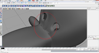
A Major Mistake here, There's a straight cut right through one of the eyes. Apparently some of the Vertex weren't merged properly..
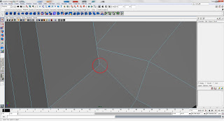
So here's one of the problems like i've mentioned above about the vertex.
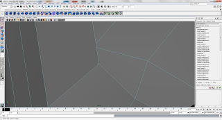
=========================
How i solved it
=========================
1. Locate the problem area (In vertex mode)
2. Zoom in and find the vertex that's causing the problem
3. Select the 2 un-joined vertex
4. Merge them together using the Merge to Center Tool
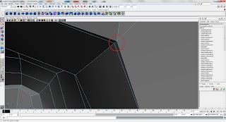
Apprently, i found another similar problem as the above picture.
Both of which i found the errors by zooming within the head since the vertex weren't visible from the outside of the head.
I also switched between the smoothness of the model so better pin-point the error.
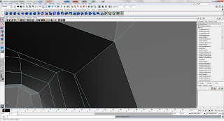
So i've used the same method of selecting then merging the vertex together.

=========================
Final Improvements
=========================

So after finding out the errors of the head, i managed to solve the problems of half of the head.
Thanks to Maya being so useful, I decided to be "lazy" and delete half the head away.
Of course, deleting the face would goes as follows:

=========================
Steps
=========================

1. Go to Face Mode
2. Select Half the Head using the Front View
3. Hit the Delete Button (yup that's easy, huh?)
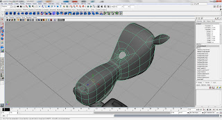
Here's what you'll get after you've deleted half the head away.
(Yay! only the nice part of the head is left!)
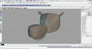
Finally i did a Mirror Geometry to Duplicate and Merge the two pieces together.
Before doing that though, i filled out the Eyes of the Cow.

Why?

This is because the first time i did it without filling it in, I ended up with the points on the eyes being merged into the center. Not very pretty and not easy to just delete the face away after that. So i filled out the eyes.

After filling it out you simply get a single big piece of face. After the merge, all you have to do is select the face you filled and it's mirror and delete it. It'll go right back to how it use to look like (with the other side of course~)

That's the end of the Head, on to the body!!!

=========================
Cow Body
=========================

Firstly, as usual, an Image of the "errors" or unhappy areas all highlights and labeled :)

The Neck (One) seemed too small out of the body.
The Arms (Two (a) and (b)) were just ... capsules..thingys... With extra edge rings (not very useful)
The Feet (Three) looked plain funny. Too tiny for the giant body it has to support!!
The Body (Four) seemed too boxy.
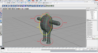
=========================
Neck
=========================
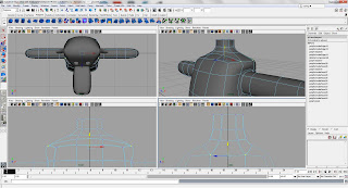
What i did here was to use Vertex Mode (yes, it's awesome) and the basic move and re-sizing tool to shape the neck to make it more round as well as more wide. A little curve at the tip of the neck seemed nice, so.. yeah.

=========================
The Arm
=========================
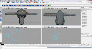
I found the Arms a little too low. So i moved it up, as usual used the Basic tools in Vertex Mode to shape the body to make the top a little more tiny and the bottom belly to be bigger. This gives it more exaggeration.
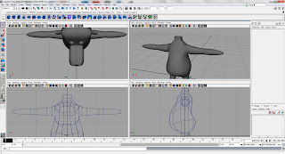
So as usual, I deleted half of the body and mirrored it to make it look similar.

=========================
The Legs
=========================
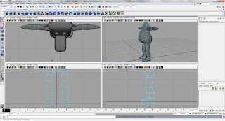
Like the Arms, it was just like 2 capsule-like-things, so i used the vertex from which made the extra rings (which was previously deemed useless) to shape out the leg.

Honestly, i think it still looks a little awkward, however there's more shape to it. I also enlarged the feet a little and give it a little more shape.

=========================
The Body
=========================
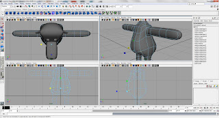
Here's the part where i shaped the "shapeless" body until something more exaggerated and a little more character. I used the Vertex Mode to move the vertex up and down to give the body a nice smooth curve from the side view.

After that, i used the re-sizing tool to either widen the gap between the 2 vertex or make it smaller.
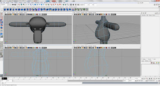
The other thing i did was to shape the back to make it more curvy? and the butt actually looks better. Doesn't stick out too much yet there was the shape.

So that's all for the Body. Moving onto the HANDS~

=========================
Cow Hand
=========================
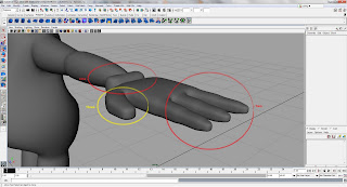
Above image shows some of the parts i would like to change. The Thumb looking a little flat so are the fingers and the edge of the glove is just...tiny? and boxy.
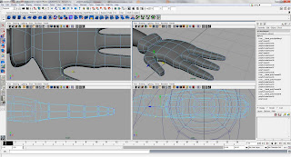
So after playing around with the vertex and shaping it again, i made the hand (glove) a little nicer. For the edge, i widen it and made it rounder.
For the Fingers and Thumb, I shaped it such that it has some obvious joint parts.
Finally, i shaped the palm of the hand. I pushed the bottom of the palm up and a part of it down to symbolize the bone structure of a human hand a little.
Finally for the thumb i shaped it such that the tip is thinner and the base is wider.

=========================
Reflections
=========================

In this whole improvement stage, i've learned that to make a model look "perfect" takes time and patience to shape it right. And the amount of edge rings and vertex matters when you shape the model. If you're missing one edge ring, you're gonna be missing out a joint.

So, i'll keep trying to improve from here on!! :)

Next update will be about my Character!!
(Once i'm done with her 3/4 View =.=)

Cheers!
Elixian

Tuesday, January 10, 2012

[ Week One ]

=======================
Cow
=======================

Screenshots of my progress~ I've finished my "Cow" XD

Done in school : Starting out the body :)

Shaping the body using Vertex

Extruding the legs :D

Making of the Neck :)

Extrude the edges, tadah! the Neck!

Finished the Body!! :D

Continued at home, the hand :)

Thumb's all out!

Fingers made and glove shape is done!

Fixing the fingers :)

Final Product of my "Cow"

=======================
Reflection
=======================

For this time, I've learned to switch between allowing my faces to stick together or go separate. The only trouble i have is estimating the size and to change the shape of the body to fit well with the example given. However it was fun :)

Just as before, it's good practice as well as good recap from IN3D!!

That's all for now :)

Cheers,
Elixian